Enterprise Software, as it exists today, is completely abysmal when it comes to design and usability. I don’t think the concept of User Experience even exists in this domain.
This is not a subjective viewpoint that I am presenting here. Just look at the millions of dollars and manpower spent on Support, Training and User Documentation.
Those artifacts are direct crutches for bad design, and the smoking gun evidence that the industry as a whole could care less about putting in the upfront cost of building a delightful product.
**This article presents some simple principles for Enterprise GUI design that can help craft a better experience for your next application.**
Yes, I can empathize with you. Enterprise software is hard.
There are a million use cases, a hundred features and a ton of variation from user to user, business to business. How can you possible create an elegant design that caters to all of the various uses?
Follow these simple principles, and while you may not be getting design awards for your Real-Estate application’s design, you will certainly earn the love of your users.
Collect Requirements
First of all, let me just say. I’m a huge follower of the Getting Real movement.
Although I think writing detailed requirements documents is a waste of time when it comes to a startup, I think they are absolutely required when it comes to Enterprise Development.
I look at Requirements Documents as a contract.
When you are building a tool shed on your own backyard, it becomes a bit silly to put in the upfront time of drawing up a contract with yourself, or creating a detailed project plan, or even setting a line-by-line budget.
However, when you are building an actual house, that has dependencies on the city for zoning restrictions, interfaces with the utility company to get power and water, and the phone company to get the Internet, you absolutely need to have a plan and contract in place.
*Poor requirements gathering and scoping is probably one of the main reasons why most Enterprise Software fails, but that’s for another article.*
So, don’t kid yourself. As the first step of your design process, get some requirements down on paper.
Write down your top 3 use cases
Why 3? From my experience, aiming for 3 forces you to zoom out of the line-by-line details of your requirements and think about your product from the user’s point of view.
Thinking about your product in terms of it’s top 3 use cases allows you to craft an actual user experience.
With 3 use cases, you’re not thinking about every action that the user must make and adding a button to it.
You’re thinking about why the user is there in the first place; what he or she is trying to accomplish as a whole. And, most importantly, you are thinking about how best to help the user achieve that task in the most effective way.
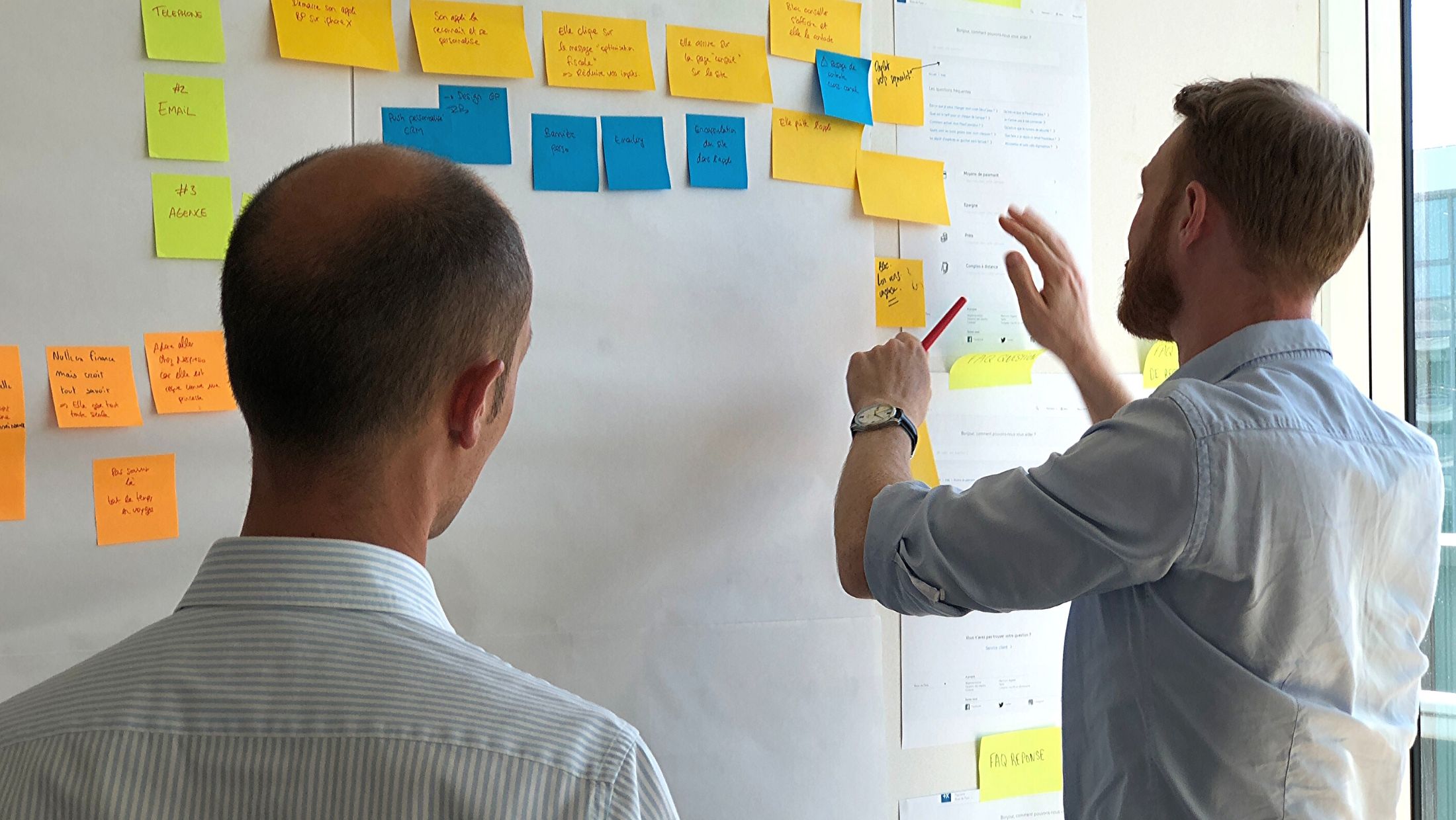
Sketch the experience
This is where you do your first design. It’s really up to you how you do it. This can be a series of paper sketches, a wireframe, or it can be actual prototype.
This prototype does not have to go into all of the details of your application, but should focus on the three modes of the application that cater to the three key use cases you identified for your product.
Once you have sketches or prototypes catering to the three high-level use cases, start going through your requirements and sketch out more of the details. At this point, it is OK for you to get into a few details.
Throw it out
Well OK, don’t throw it out, but set it aside. This is where you challenge yourself. Start over. Make it a goal to achieve the same outcome with less.
Less means a simpler flow, fewer UI elements, fewer knobs and levers.
The goal of this step is to strip down your UI until it has the bare minimum. Challenge yourself to reduce the amount of data you are showing.
When you are down to just the essential pieces of data, you’ve gotten closer to the true user problem that you are trying to solve.
This step also gives you a good opportunity to scope out your product. Do you really need to meet all of the requirements that you’ve written down?
Can your grandma use it?
I always like to picture my Grandma as the user when I am trying to design a product’s interaction.
Now obviously, if I happen to be building out some shiny Real-Estate listing application, I don’t expect my Grandmother to truly understand what is going on; but that is not the spirit of this step.
The spirit is once again to challenge yourself. Challenge yourself to think past your own engineering mindset and put your self in the user’s shoes.
Don’t just assume that your user will know to right click on Item X and then click on Item Y and then double click on Item Z to do Use Case #4.
The goal is to make it so that your user can intuitively figure out how to do the various tasks in your product without having to rely on manuals, tutorials or user guides.
Divide and conquer
Your user never performs all of the use cases all at once. A majority of the time, your user is in a certain mode.
For example, in a Real-Estate application, your user can be in any one of these distinct modes:
* Entering or Updating a house listing
* Entering or Updating her clients list
* Searching for the perfect house listing
It is important for you to be able to split up your application into these sub components. When you do this, you can simplify your UI in a task-oriented manner, and only show the things that are relevant to the task the user is performing.
This may seem like an obvious principle, but I am shocked at the number of applications that try to create one giant multi-function interface that let’s you do everything.
If you successfully identify and segregate your product into separate tasks, you can substantially reduce complexity and visual noise from your application.
How many clicks does it take?
OK, so by now you should have quite a few sketches. You’ve hopefully iterated on it a couple of times, slowly stripping away the excess.
You’ve also identified the different modes your application has and have divided them up into sub components.
Once you’ve done all this, you need to gauge how far you’ve really come. The best way that I’ve found to do this is to measure the # of clicks.
Make a list of common tasks (not the high level use cases, but actual tasks). Load up your application (or run through your sketches), and perform each of the tasks that you have identified so far.
How many clicks do each of them take? Is it 3? Is it 8? Is it 20?
There is no golden rule as to how many clicks it should take on average, but attempting to reduce the number of clicks it does take to the bare minimum (without returning to a huge multi-function interface), is an important exercise.
Yes, this does take a while.
This is certainly not an easy thing. Then again, neither is writing documentation or tutorials for your software.
This sort of exercise certainly takes away from “just code and get it done time,” but it will result in a better product when you are done with it.