Your homepage is the face of your SaaS website. This is where investors, prospects, customers, and partners will go to understand what you and your SaaS business is offering. A strong website is crucial in promoting your business’ values, and a strong homepage becomes a demand generating machine.
Every time I’m on a call with an early stage SaaS Founder discussing their GTM strategy, I mention their website.
9 times out of 10, they tell me that they’re working on redesigning it.
I get it.
As SaaS Founders, we’re always in a constant state of changing the website to see what sticks. But, is updating your website really going to meaningfully boost your conversion rate?
We often get carried away with choosing the right layout, the prettiest colors, or even the best font. Consequently, we end up leaving the content or messaging for last. Simply changing the design and feel of the website over and over again won’t magically drive more demo signups. Prioritizing the messaging on your SaaS website though? That’s gold.
In this blog, I’m going to walk you through my proven SaaS website framework that will attract, engage, and convert your ideal customers. There are 4 major principles (plus a bonus one) that you need to know when building a high converting homepage for your SaaS business website. When you follow these principles, it’ll help demystify the structure of your SaaS homepage and help you drive more and more conversions. More importantly, it’ll help you tether yourself to a core framework that you can stick to and iterate on.
SaaS Website Homepage Framework
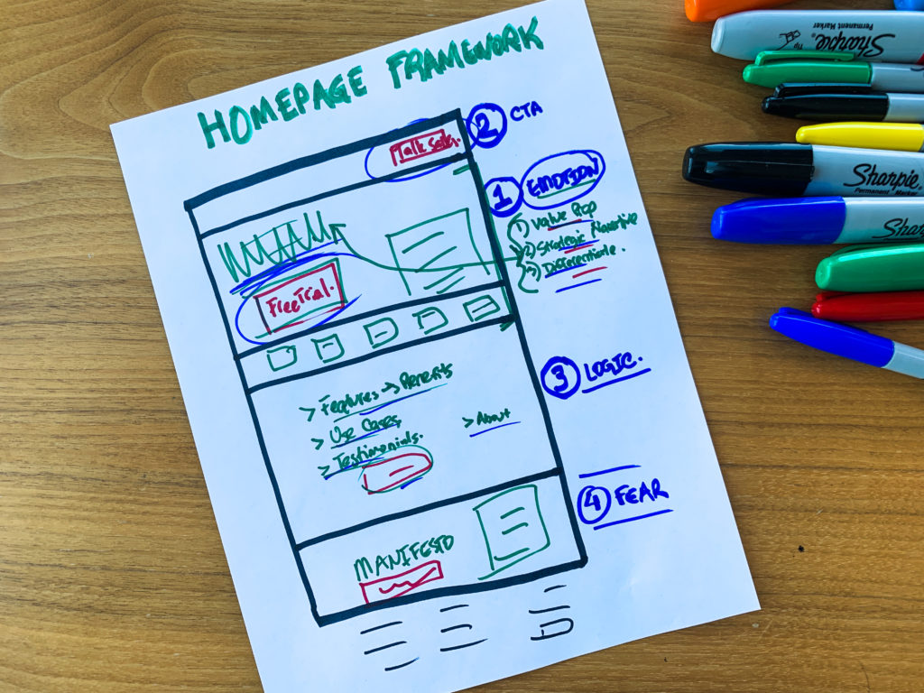
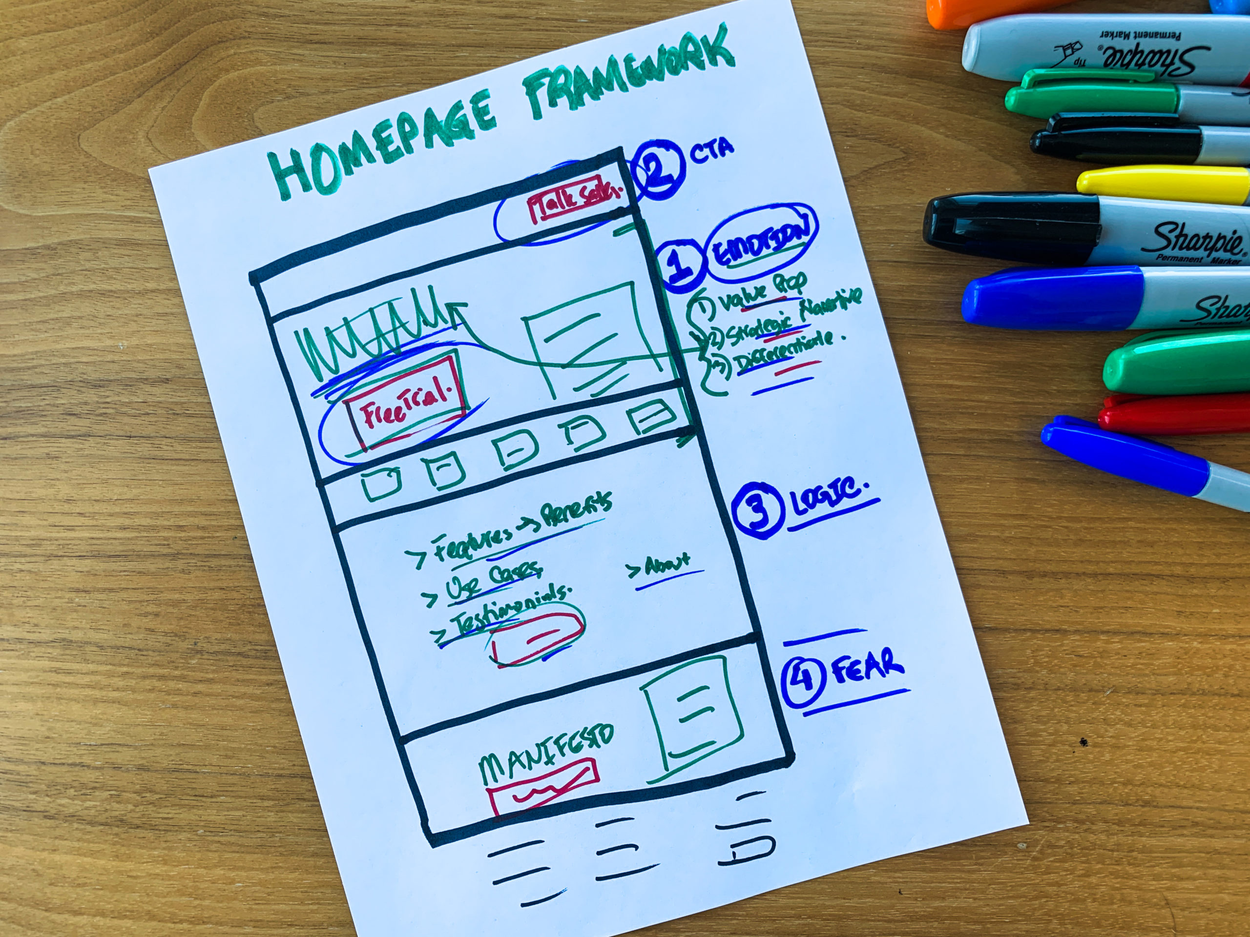
Principle #1: Emotional Messaging
The forefront section of your homepage needs to focus on copy that evokes emotion. The messaging on your SaaS website is the most important element that can differentiate you from your competitors and drive more conversions. Prioritizing the copy over design elements ensures that you’re speaking to your ideal customers in a language they understand.
People make a split decision on whether they will stay or exit based on the first section of your homepage. Think of it as your email subject line. If the subject line is wrong, the email goes unread, no matter how great the contents of the email may be. The same can be said for the emotional messaging in the first section of your homepage.
Crafting your copy to elicit emotions such as trust, excitement, or a sense of relief will allow you to establish a deeper connection with your website visitors. Emotional resonance not only helps humanize your software solution, but also helps convey your value proposition effectively. When customers feel a personal connection with your SaaS solution, they’re much more likely to engage with your product, explore its features, and ultimately convert into loyal customers.
Here are some core emotion evoking items that need to be included:
Value Proposition
This is your one-liner sentence that clearly articulates the value of your SaaS product and how it differentiates in the market. Your value proposition serves as the immediate hook that captures visitor’s attention and sets the tone for their entire user experience. It succinctly communicates what makes your SaaS solution unique and addresses the specific pain points or needs of your ideal customer. A well-crafted value proposition on your homepage helps you create a strong first impression.
Strategic Narrative
This is the story you tell across your website, product, and discovery calls. Strategic narrative is a powerful storytelling approach that relays the vision, mission, and purpose of your SaaS business. A proper strategic narrative informs visitors about what you offer, explains why you exist, and how you can make a meaningful impact in their lives or businesses. This narrative helps create an emotional connection, resonating with the values and aspirations of your ideal customers. By positioning your SaaS solution within a larger story, you inspire trust, loyalty, and long-term engagement. A strategic narrative on your homepage builds a memorable brand identity and fosters lasting relationships with your ICP.
Differentiating Factor
Incorporating a differentiating factor helps your visitors quickly understand why your SaaS solution stands out from the crowd. These factors highlight the specific advantages your SaaS product offers, emphasizing your value proposition. You want to showcase what distinguishes you from your competitors. Displaying these differentiators sets clear expectations, motivates visitors to explore further, and drives conversions and business growth.
That first impression is EVERYTHING, and you really want to keep your visitors longer than a few seconds. Adding these elements and evoking emotion throughout your SaaS website content can transform your homepage from an information hub to a persuasive storytelling platform that really resonates with your viewer’s needs and aspirations.
SaaS website best practice tip #1: Understand how a homepage is structured.
Principle #2: Call-To-Action
What is a call-to-action (CTA)? Definitively, a CTA is the persuasive message or prompt that is designed to encourage a specific action from your website visitor. They are aimed to motivate your website visitors to take a desired next step. For example: signing up for a demo, making a purchase, or engaging with content.
Having a well-crafted and well-placed CTA on the homepage of your SaaS business website is absolutely crucial. It serves as the guiding beacon for your visitors, directing them to the next step of their customer journey and driving them towards conversion. When you make your desired action easily accessible, you increase the likelihood of converting these visitors into valuable leads or customers. Your homepage CTA acts as the gateway to your SaaS solution and is an indispensable element within your website framework.
On a typical SaaS website, the two main options available for your CTA are a “Talk to Sales” button, or a “Start Free Trial” button. Which one you choose is highly dependent on which growth strategy you are utilizing for your SaaS business. If you are a Product-Led Growth Engine, you would use the “Start Free Trial” CTA. If you are a Sales-Led Growth Engine, you would use the “Talk to Sales” CTA. Here’s a video explaining which growth strategy your SaaS business fits.
Sometimes SaaS Founders will cheat and try to use both call-to-actions. This will not be optimal for your website as it may confuse your viewers on which step they need to take. Pick one of the two that is most appropriate for your market, specify who you are talking to, and determine what their purchase behaviors are.
SaaS website best practice tip #2: Repeat the CTA throughout your entire SaaS homepage (the entire website really.)
Principle #3: Presenting the Logic for the Undecided
While emotional messaging and a great CTA can be highly effective with many potential customers, some may not be swayed by emotion alone. It’s essential to include logic and factual information on your SaaS website as well. For some website visitors, data, facts, and clear explanations are paramount to their buying decisions.
Here are some critical items you should include in your logical section:
Software Features & Benefits
One of the things people want to see are your software’s features and benefits. Displaying them on your homepage helps users really understand what your product can do and how these features address their specific needs and pain points. This information empowers visitors to assess logically whether your software aligns with their requirements or goals.
Case Studies (list out 4-5)
Having case studies offer real-world examples of how your software has successfully addressed the challenges or pain points of previous customers. These serve as powerful social proof and build your credibility among your ideal customers who may be considering your product. This helps visitors understand how your solution can be applied to their own situations and motivates them to move further down the buyer journey.
Statistics
Statistics provide quantifiable evidence of your software’s impact and effectiveness. These figures serve as persuasive data points that demonstrate your solution’s tangible benefits. When visitors see compelling numbers that highlight the value of your SaaS product, they are more likely to trust your claims, engage with your content, and consider your solution a valuable asset.
Testimonials
Incorporating testimonials on the homepage of your SaaS business website is a powerful way to build trust and credibility with your prospective customers. Testimonials provide authentic voices and real-life experiences from satisfied customers who have benefited from your software solution. These become quantifiable social proof and reassures visitors that your product delivers on its promises. It also makes it easier for potential customers to envision how your SaaS product or service could benefit them.
Providing tangible evidence and factual reliability can reassure skeptical visitors to help them make better informed decisions based on their specific needs and objectives. The combination of emotional resonance, a strong CTA, and logical reasoning throughout your SaaS homepage creates a persuasive approach. Your SaaS website will cater to a broader range of potential customers and strengthen your SaaS business’ trustworthiness and credibility.
SaaS website best practice tip #3: A homepage is different from a landing page. On a homepage, you may incorporate additional content about your business, whereas on the landing page, you wouldn’t.
Principle #4: Making Your Visitors Fear What They’re Missing
Instilling a sense of fear of missing out (FOMO) on your SaaS website homepage is a potent strategy to drive user engagement and conversions.
You want your website visitors and ideal customers to know what they are missing out on if they do not take action RIGHT AWAY. When visitors perceive the value and benefits of your software and fear not taking action, they are more likely to explore further and ultimately click on your CTA.
You can showcase limited-time offers, highlight success stories, and display the potential gains your SaaS product provides. This psychological trigger will prompt your visitors to take immediate action, as they fear losing out on the advantages that other users are already enjoying. FOMO is real, and people long for a sense of belonging while gaining competitive advantages. Tapping into FOMO is a skillful, compelling strategy for motivating website visitors to become customers of your SaaS product.
Principle #5 (Bonus): Linking Your Manifesto or Lead Magnet
You want to round out the last part of your homepage by linking to your Manifesto or Lead Magnet. If visitors don’t want to act on the primary CTA, this will be the secondary CTA to learn even more about your SaaS business. You could say something along the lines of “Hey, you don’t have to commit but here’s a free ebook so you won’t lose out.”
Now, what is a Manifesto? Your Manifesto is the central content asset you’ll use to generate awareness, demand and pipeline. It teaches them about the macro trend or problem they are suffering, how you think about it, and the big transformation your SaaS product or service is bringing. A great manifesto explains why you do what you do, and why your ideal customer profile should care and take action.
Your Manifesto is the centerpiece of your Go-To-Market strategy. If you would like to learn more, watch this video!
In Conclusion
Following these core principles and the homepage framework will set you and your SaaS website up for success. Rather than wasting time re-designing, you must focus on the messaging throughout your homepage. Ultimately, you want your website visitors to fully understand your SaaS business’ values and what you’re offering. Show them why they should choose you over competing companies. When you do it this way, you make sure your SaaS homepage addresses all objections. That is how you nail a high converting SaaS website homepage design.
If you’re a SaaS Founder and you’re still trying to figure out all the pieces to your GTM growth machine – then I invite you to check out my SaaS GTM Coaching Program. Inside this program, I work with hundreds of SaaS Founders like you to establish a proper ICP, craft their messaging, strategic narrative, Manifesto, and help them execute a scalable GTM strategy.